CSS Grid Container
Grid Container
To make an HTML element behave as a grid container, you have to set the display property to grid or inline-grid.
Grid containers consist of grid items, placed inside columns and rows.
The grid-template-columns Property
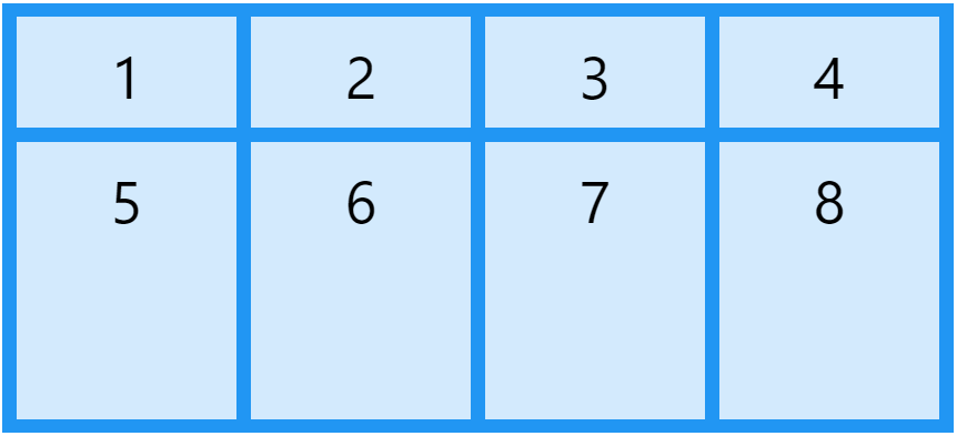
The grid-template-columns property defines the number of columns in your grid layout, and it can define the width of each column.
The value is a space-separated-list, where each value defines the width of the respective column.
If you want your grid layout to contain 4 columns, specify the width of the 4 columns, or "auto" if all columns should have the same width.
Example of a grid with 4 columns:
.grid-container {
	display:  grid;
	grid-template-columns:  auto auto auto auto;
}
If you have more than 4 items in a 4 columns grid, the grid will automatically add a new row to put the items in.
The grid-template-columns property can also be used to specify the size (width) of the columns.
Example: set size for the four columns:
.grid-container {
	display:  grid;
	grid-template-columns:  80px 200px auto 40px;
}
The grid-template-rows Property
The grid-template-rows property defines the height of each row.
The value is a space-separated-list, where each value defines the height of the respective row:
.grid-container {
	display:  grid;
	grid-template-rows:  80px 200px;
}
The justify-content Property
The justify-content property is used to align the whole grid inside the container.

The grid's total width has to be less than the container's width for the justify-content property to have any effect.
justify-content: space-evenly
The value space-evenly will give the columns equal amount of space between, and around them.
.grid-container {
	display:  grid;
	justify-content:  space-evenly;
}

justify-content: space-around
The value space-around will give the columns equal amount of space around them.
.grid-container {
	display:  grid;
	justify-content:  space-around;
}

justify-content: space-between
The value space-between will give the columns equal amount of space between them.
.grid-container {
	display:  grid;
	justify-content:  space-between;
}

justify-content: center
The value center will align the grid in the middle of the container.
.grid-container {
	display:  grid;
	justify-content:  center;
}

justify-content: start
The value start will align the grid at the beginning of the container.
.grid-container {
	display:  grid;
	justify-content:  start;
}

justify-content: end
The value end will align the grid at the end of the container.
.grid-container {
	display:  grid;
	justify-content:  end;
}

The align-content Property
The align-content property is used to vertically align the whole grid inside the container.

The grid's total height has to be less than the container's height for the align-content property to have any effect.
align-content: space-evenly
The value space-evenly will give the rows equal amount of space between, and around them:
.grid-container {
	display:  grid;
	height:  400px;
	align-content:  space-evenly;
}

align-content: space-around
The value space-around will give the rows equal amount of space around them:
.grid-container {
	display:  grid;
	height:  400px;
	align-content:  space-around;
}

align-content: space-between
The value space-between will give the rows equal amount of space between them:
.grid-container {
	display:  grid;
	height:  400px;
	align-content:  space-between;
}

align-content: start
The value start will align the rows at the beginning of the container:
.grid-container {
	display:  grid;
	height:  400px;
	align-content:  start;
}

align-content: center
The value center will align the rows in the middle of the container:
.grid-container {
	display:  grid;
	height:  400px;
	align-content:  center;
}

align-content: end
The value end will align the rows at the end of the container:
.grid-container {
	display:  grid;
	height:  400px;
	align-content:  end;
}
