CSS Box Shadow
CSS Box Shadow
The CSS box-shadow property is used to apply one or more shadows to an element.
Specify a Horizontal and a Vertical Shadow
In its simplest use, you only specify a horizontal and a vertical shadow. The default color of the shadow is the current text-color.
div {
	box-shadow:  10px 10px;
}

Common cases
Specify a Color for the Shadow
The color parameter defines the color of the shadow.
div {
	box-shadow:  10px 10px lightblue;
}

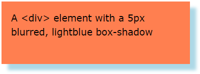
Add a Blur Effect to the Shadow
The blur parameter defines the blur radius. The higher the number, the more blurred the shadow will be.
div {
	box-shadow:  10px 10px 5px lightblue;
}
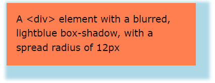
Set the Spread Radius of the Shadow
The spread parameter defines the spread radius. A positive value increases the size of the shadow, a negative value decreases the size of the shadow.
div {
	box-shadow:  10px 10px 5px 12px lightblue;
}
Set the inset Parameter
The inset parameter changes the shadow from an outer shadow (outset) to an inner shadow.
div {
	box-shadow:  10px 10px 5px lightblue inset;
}

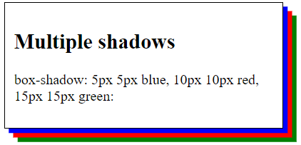
Add Multiple Shadows
An element can also have multiple shadows:
div {
	 box-shadow: 5px 5px blue, 10px 10px red, 15px 15px green;
}
Cards
You can also use the box-shadow property to create paper-like cards.
div.card {
	box-shadow:  0 4px 8px 0 rgba(0, 0, 0, 0.2), 0 6px 20px 0 rgba(0, 0, 0, 0.19);
}
