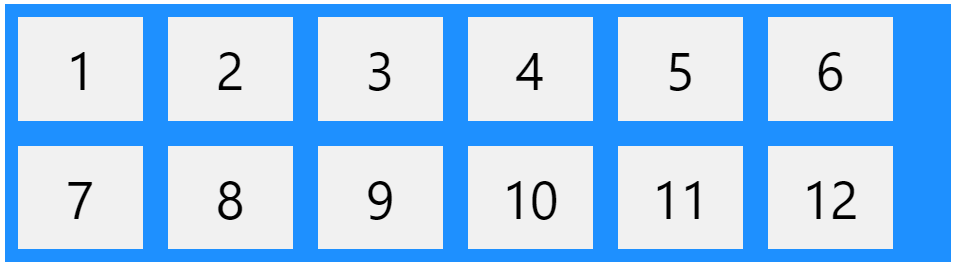
CSS Flex Container
Parent Element (Container)
The flex container becomes flexible by setting the display property to flex:
.flex-container {
	display:  flex;
}
CSS Flexbox Container Properties
The following table lists all the CSS Flexbox Container properties:
| Property | Description |
|---|---|
| align-content | Modifies the behavior of the flex-wrap property. It is similar to align-items, but instead of aligning flex items, it aligns flex lines |
| align-items | Vertically aligns the flex items when the items do not use all available space on the cross-axis |
| display | Specifies the type of box used for an HTML element |
| flex-direction | Specifies the direction of the flexible items inside a flex container |
| flex-flow | A shorthand property for flex-direction and flex-wrap |
| flex-wrap | Specifies whether the flex items should wrap or not, if there is not enough room for them on one flex line |
| justify-content | Horizontally aligns the flex items when the items do not use all available space on the main-axis |
flex-direction Property
The flex-direction property defines in which direction the container wants to stack the flex items.

Example: the column value stacks the flex items vertically (from top to bottom):
.flex-container {
	display:  flex;
	flex-direction:  column;
}
Example: the column-reverse value stacks the flex items vertically (but from bottom to top):
.flex-container {
	display:  flex;
	flex-direction:  column-reverse;
}
Example: the row value stacks the flex items horizontally (from left to right):
.flex-container {
	display:  flex;
	flex-direction:  row;
}
Example: the row-reverse value stacks the flex items horizontally (but from right to left):
.flex-container {
	display:  flex;
	flex-direction:  row-reverse;
}
flex-wrap Property
The flex-wrap property specifies whether the flex items should wrap or not.
Example: The wrap value specifies that the flex items will wrap if necessary
.flex-container {
	display:  flex;
	flex-wrap:  wrap;
}
Example: the nowrap value specifies that the flex items will not wrap (this is default):
.flex-container {
	display:  flex;
	flex-wrap:  nowrap;
}
Example: the wrap-reverse value specifies that the flexible items will wrap if necessary, in reverse order:
.flex-container {
	display:  flex;
	flex-wrap:  wrap-reverse;
}
flex-flow Property
The flex-flow property is a shorthand property for setting both the flex-direction and flex-wrap properties.
.flex-container {
	display:  flex;
	flex-flow:  row wrap;
}
justify-content Property
The justify-content property is used to align the flex items:

Example: the center value aligns the flex items at the center of the container.
.flex-container {
	display:  flex;
	justify-content:  center;
}
Example: the flex-start value aligns the flex items at the beginning of the container (this is default).
.flex-container {
	display:  flex;
	justify-content:  flex-start;
}
Example: the space-around value displays the flex items with space before, between, and after the lines.
.flex-container {
	display:  flex;
	justify-content:  space-around;
}
align-items Property
The align-items property is used to align the flex items.

In these examples we use a 200 pixels high container, to better demonstrate the align-items property.
Example: the center value aligns the flex items in the middle of the container.
.flex-container {
	display:  flex;
	height:  200px;
	align-items:  center;
}
Example: the flex-start value aligns the flex items at the top of the container.
.flex-container {
	display:  flex;
	height:  200px;
	align-items:  flex-start;
}
Example: the flex-end value aligns the flex items at the bottom of the container.
.flex-container {
	display:  flex;
	height:  200px;
	align-items:  flex-end;
}
Example: the stretch value stretches the flex items to fill the container (this is default).
.flex-container {
	display:  flex;
	height:  200px;
	align-items:  stretch;
}
align-content Property
The align-content property is used to align the flex lines.
In these examples we use a 600 pixels high container, with the flex-wrap property set to wrap, to better demonstrate the align-content property.
Example: the space-between value displays the flex lines with equal space between them:
.flex-container {
	display:  flex;
	height:  600px;
	flex-wrap:  wrap;
	align-content:  space-between;
}
Example: the space-around value displays the flex lines with space before, between, and after them:
.flex-container {
	display:  flex;
	height:  600px;
	flex-wrap:  wrap;
	align-content:  space-around;
}
Example: the stretch value stretches the flex lines to take up the remaining space (this is default):
.flex-container {
	display:  flex;
	height:  600px;
	flex-wrap:  wrap;
	align-content:  stretch;
}
Example: the center value displays the flex lines in the middle of the container:
.flex-container  {
	display:  flex;
	height:  600px;
	flex-wrap:  wrap;
	align-content:  center;
}
Example: the flex-start value displays the flex lines at the start of the container:
.flex-container {
	display:  flex;
	height:  600px;
	flex-wrap:  wrap;
	align-content:  flex-start;
}
Example: the flex-end value displays the flex lines at the end of the container:
.flex-container {
	display:  flex;
	height:  600px;
	flex-wrap:  wrap;
	align-content:  flex-end;
}
Another example: Perfect Centering
In the following example we will solve a very common style problem: perfect centering.

Set both the justify-content and align-items properties to center, and the flex item will be perfectly centered:
.flex-container {
	display:  flex;
	height:  300px;
	justify-content:  center;
	align-items:  center;
}