CSS Masking
With CSS masking you create a mask layer to place over an element to partially or fully hide portions of the element.
The CSS mask-image Property
The CSS mask-image property specifies a mask layer image.
The mask layer image can be a PNG image, an SVG image, a CSS gradient, or an SVG <mask> element.
CSS Masking Properties
The following table lists all the CSS masking properties:
| Property | Description |
|---|---|
| mask-image | Specifies an image to be used as a mask layer for an element |
| mask-mode | Specifies whether the mask layer image is treated as a luminance mask or as an alpha mask |
| mask-origin | Specifies the origin position (the mask position area) of a mask layer image |
| mask-position | Sets the starting position of a mask layer image (relative to the mask position area) |
| mask-repeat | Specifies how the mask layer image is repeated |
| mask-size | Specifies the size of a mask layer image |
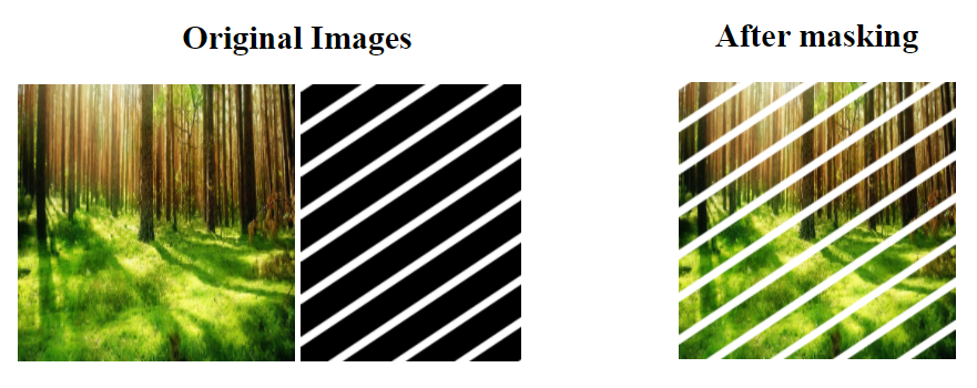
Use an Image as the Mask Layer
To use a PNG or an SVG image as the mask layer, use a url() value to pass in the mask layer image.
The mask image needs to have a transparent or semi-transparent area. Black indicates fully transparent.
.mask {
	-webkit-mask-image:  url(my-mask.png);
	mask-image:  url(my-mask.png);
	-webkit-mask-repeat:  no-repeat;
	mask-repeat:  no-repeat;
}
Explanation:
- The
mask-imageproperty specifies the image to be used as a mask layer for an element. - The
mask-repeatproperty specifies if or how a mask image will be repeated. Theno-repeatvalue indicates that the mask image will not be repeated (the mask image will only be shown once). - The image on which to apply the mask use
class="mask"
Use Gradients as the Mask Layer
CSS linear and radial gradients can also be used as mask images.
Linear Gradient Examples
Example of a linear gradient used as a mask layer
.mask1 {
	-webkit-mask-image:  linear-gradient(black, transparent);
	mask-image:  linear-gradient(black, transparent);
}
Radial Gradient Examples
Example of a radial gradient used as a mask layer
.mask {
	-webkit-mask-image:  radial-gradient(circle, black 50%, rgba(0, 0, 0, 0.5) 50%);
	mask-image:  radial-gradient(circle, black 50%, rgba(0, 0, 0, 0.5) 50%);
}
Use SVG as the Mask Layer
The SVG <mask> element can be used inside an SVG graphic to create masking effects.
Example of a SVG mask layer with a triangle shape:
<svg width="600" height="400">
	<mask id="svgmask1">
		<polygon fill="#ffffff"  points="200 0, 400 400, 0 400"></polygon>
	</mask>
	<image xmlns:xlink="http://www.w3.org/1999/xlink"  xlink:href="img_5terre.jpg"  mask="url(#svgmask1)">	</image>
</svg>