CSS Radial Gradients
CSS gradients let you display smooth transitions between two or more specified colors.
CSS defines three types of gradients:
- Linear Gradients (goes down/up/left/right/diagonally)
- Radial Gradients (defined by their center)
- Conic Gradients (rotated around a center point)
CSS Conic Gradients
A conic gradient is a gradient with color transitions rotated around a center point.
To create a conic gradient you must define at least two colors.
background-image: conic-gradient([from <angle>] [at <position>,] <color> [<degree>], <color> [<degree>], ..._);
By default, angle is 0deg and position is center. If no degree is specified, the colors will be spread equally around the center point.
Example
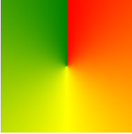
Three Colors
The following example shows a conic gradient with three colors:
#grad {
	background-image:  conic-gradient(red, yellow, green);
}
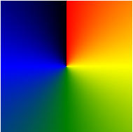
Five Colors
The following example shows a conic gradient with five colors:
#grad {
	background-image:  conic-gradient(red, yellow, green, blue, black);
}
Three Colors and Degrees
The following example shows a conic gradient with three colors and a degree for each color:
#grad {
	background-image:  conic-gradient(red 45deg, yellow 90deg, green 210deg);
}

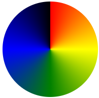
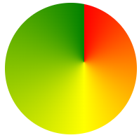
Create Pie Charts
Just add border-radius: 50% to make the conic gradient look like a pie:
#grad {
	background-image:  conic-gradient(red, yellow, green, blue, black);
	border-radius:  50%;
}
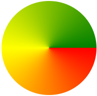
Here is another pie chart with defined degrees for all the colors:
#grad {
	background-image:  conic-gradient(red 0deg, red 90deg, yellow 90deg, yellow 180deg, green 180deg, green 270deg, blue 270deg);
	border-radius:  50%;
}

Conic Gradient With Specified From Angle
The [from angle] specifies an angle that the entire conic gradient is rotated by.
The following example shows a conic gradient with a from angle of 90deg:
#grad {
	background-image:  conic-gradient(red 0deg, red 90deg, yellow 90deg, yellow 180deg, green 180deg, green 270deg, blue 270deg);
	border-radius:  50%;
}
Conic Gradient With Specified Center Position
The [at position] specifies the center of the conic gradient.
The following example shows a conic gradient with a center position of 60% 45%:
#grad {
	background-image:  conic-gradient(at 60% 45%, red, yellow, green);
}
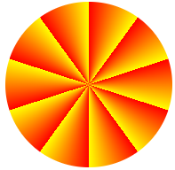
Repeating a Conic Gradient
The repeating-conic-gradient() function is used to repeat conic gradients:
#grad {
	background-image:  repeating-conic-gradient(red 10%, yellow 20%);
	border-radius:  50%;
}
Here is a repeating conic gradient with defined color-starts and color-stops:
#grad {
	background-image:  repeating-conic-gradient(red 0deg 10deg, yellow 10deg 20deg, blue 20deg 30deg);
	border-radius:  50%;
}
