CSS Flex Responsive
Responsive Flexbox
You learned from the CSS Media Queries chapter that you can use media queries to create different layouts for different screen sizes and devices.

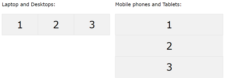
For example, if you want to create a two-column layout for most screen sizes, and a one-column layout for small screen sizes (such as phones and tablets), you can change the flex-direction from row to column at a specific breakpoint (800px in the example below):
.flex-container {
	display:  flex;
	flex-direction:  row;
}

/* Responsive layout - makes a one column layout instead of a two-column layout */
@media (max-width: 800px) {
	.flex-container  {
		flex-direction:  column;
	}
}
Another way is to change the percentage of the flex property of the flex items to create different layouts for different screen sizes. Note that we also have to include flex-wrap: wrap; on the flex container for this example to work:
.flex-container {
	display:  flex;
	flex-wrap:  wrap;
}

.flex-item-left {
	flex:  50%;
}

.flex-item-right {
	flex:  50%;
}

/* Responsive layout - makes a one column layout instead of a two-column layout */
@media (max-width: 800px) {
	.flex-item-right, .flex-item-left  {
		flex:  100%;
	}
}