CSS Box Sizing
CSS Box Sizing
The CSS box-sizing property allows us to include the padding and border in an element's total width and height.
Without the CSS box-sizing Property
By default, the width and height of an element is calculated like this:
width + padding + border = actual width of an element
height + padding + border = actual height of an element
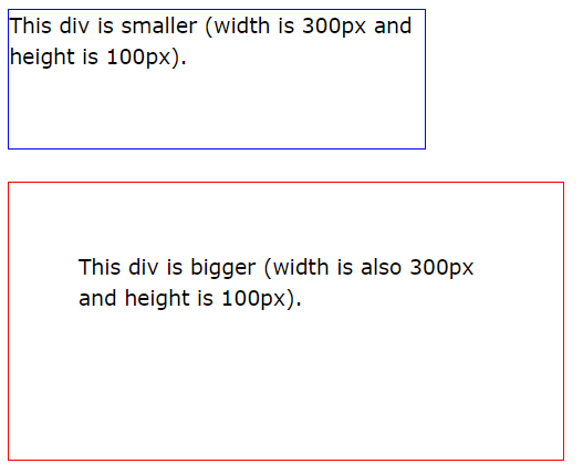
This means: When you set the width/height of an element, the element often appears bigger than you have set (because the element's border and padding are added to the element's specified width/height).
The following illustration shows two <div> elements with the same specified width and height:

The two <div> elements above end up with different sizes in the result (because div2 has a padding specified):
.div1 {
	width:  300px;
	height:  100px;
	border:  1px solid blue;
}

.div2 {
	width:  300px;
	height:  100px;
	padding:  50px;
	border:  1px solid red;
}
The box-sizing property solves this problem.
With the CSS box-sizing Property
The box-sizing property allows us to include the padding and border in an element's total width and height.
If you set box-sizing: border-box; on an element, padding and border are included in the width and height:
Here is the same example as above, with box-sizing: border-box; added to both <div> elements:
.div1 {
	width:  300px;
	height:  100px;
	border:  1px solid blue;
	box-sizing:  border-box;
}

.div2 {
	width:  300px;
	height:  100px;
	padding:  50px;
	border:  1px solid red;
	box-sizing:  border-box;
}
Since the result of using the box-sizing: border-box; is so much better, many developers want all elements on their pages to work this way.
The code below ensures that all elements are sized in this more intuitive way. Many browsers already use box-sizing: border-box; for many form elements (but not all - which is why inputs and text areas look different at width: 100%;).
Applying this to all elements is safe and wise:
* {
	box-sizing:  border-box;
}