CSS Font-size
The font-size property in CSS is used to specify the size of the font. It affects the size of the text of an element. Its default value is medium and can be applied to every element. The values of this property include xx-small, small, x-small, etc.
Being able to manage the text size is important in web design. However, you should not use font size adjustments to make paragraphs look like headings, or headings look like paragraphs.
Always use the proper HTML tags, like <h1> - <h6> for headings and <p> for paragraphs.
The font-size value can be an absolute, or relative size.
Absolute size:
- Sets the text to a specified size
- Does not allow a user to change the text size in all browsers (bad for accessibility reasons)
- Absolute size is useful when the physical size of the output is known
Relative size:
- Sets the size relative to surrounding elements
- Allows a user to change the text size in browsers
If you do not specify a font size, the default size for normal text, like paragraphs, is 16px (16px=1em).
Font-size with pixels
When we set the size of text with pixels, then it provides us the full control over the size of the text.
Example:
<html>
<head>
<style>
#first {
font-size: 40px;
}
#second {
font-size: 20px;
}
</style>
</head>
<body>
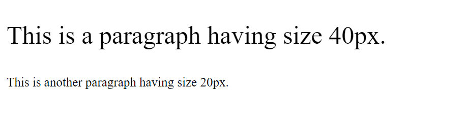
<p id="first">This is a paragraph having size 40px</p>
<p id="second">This is another paragraph having size 20px.</p>
</body>
</html>
Output:
Font-size with em
It is used to resize the text. Most of the developers prefer em instead of pixels. It is recommended by the world wide web consortium (W3C). As stated above, the default text size in browsers is 16px. So, we can say that the default size of 1em is 16px.
The formula for calculating the size from pixels to em is em = pixels/16.
Example:
<html>
<head>
<style>
#first {
/* 40px/16=2.5em */
font-size: 2.5em;
}
#second {
/* 30px/116=1.875em */
font-size: 1.875em;
}
#third {
/* 14px/16=0.875em */
font-size: 0.875em;
}
</style>
</head>
<body>
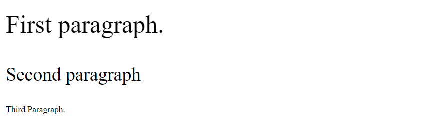
<p id='first'>First paragraph.</p>
<p id='second'>Second paragraph</p>
<p id='third'>Third Paragraph.</p>
</body>
</html>
Output:
Responsive font size
We can set the size of the text by using a vw unit, which stands for the 'viewport width'. The viewport is the size of the browser window.
1vw = 1% of viewport width.
If the width of the viewport is 50cm, then the 1vw is equal to 0.5 cm.
Example:
<html>
<body>
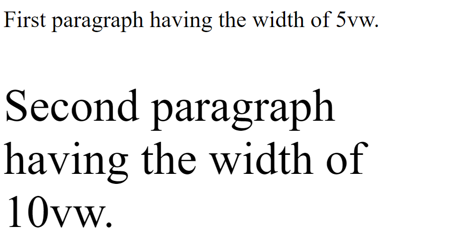
<p style="font-size:5vw;">First paragraph having the width of 5vw.</p>
<p style="font-size:10vw;">Second paragraph having the width of 10vw.</p>
</body>
</html>
Output:
Font-size with the length property
It is used to set the size of the font in length. The length can be in cm, px, pt, etc. Negative values of length property are not allowed in font-size.
Example:
<html>
	<head>
		<style>
			.length {
				color:red;
				font-size: 5cm;
			}
		</style>
	</head>
	<body>
		<h1>font-size property</h1>
		<p class = "length">A paragraph having length 5cm.</p>
	</body>
</html>