CSS Website Layout
Website Layout
A website is often divided into headers, menus, content and a footer:
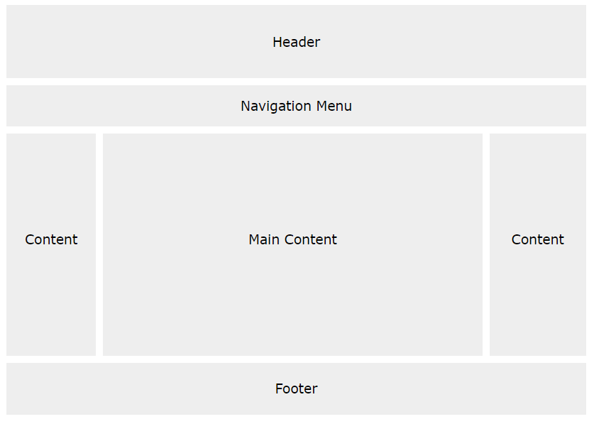
There are tons of different layout designs to choose from. However, the structure above, is one of the most common, and we will take a closer look at it in this tutorial.
Header
A header is usually located at the top of the website (or right below a top navigation menu). It often contains a logo or the website name:
.header {
	background-color:  #F1F1F1;
	text-align:  center;
	padding:  20px;
}
Navigation Bar
A navigation bar contains a list of links to help visitors navigating through your website:
/* The navbar container */
.topnav {
	overflow:  hidden;
	background-color:  #333;
}

/* Navbar links */
.topnav a {
	float:  left;
	display:  block;
	color:  #f2f2f2;
	text-align:  center;
	padding:  14px 16px;
	text-decoration:  none;
}

/* Links - change color on hover */
.topnav a:hover {
	background-color:  #ddd;
	color:  black;
}
Content
The layout in this section, often depends on the target users. The most common layout is one (or combining them) of the following:
- 1-column (often used for mobile browsers)
- 2-column (often used for tablets and laptops)
- 3-column layout (only used for desktops)

Example:
/* Create three equal columns that float next to each other */
.column {
	float:  left;
	width:  33.33%;
}

/* Clear floats after the columns */
.row:after {
	content:  "";
	display:  table;
	clear:  both;
}

/* Responsive layout - makes the three columns stack on top of each other instead of next to each other on smaller screens (600px wide or less) */
@media screen and (max-width: 600px) {
	.column  {
		width:  100%;
	}
}
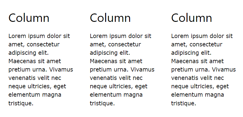
To create a 2-column layout, change the width to 50%. To create a 4-column layout, use 25%, etc.
A more modern way of creating column layouts, is to use CSS Flexbox. However, it is not supported in Internet Explorer 10 and earlier versions. If you require IE6-10 support, use floats (as shown above).
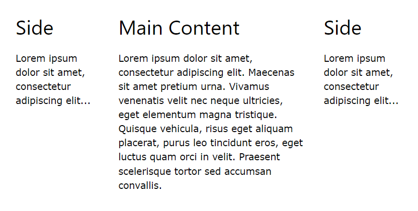
Unequal Columns
The main content is the biggest and the most important part of your site.
It is common with unequal column widths, so that most of the space is reserved for the main content. The side content (if any) is often used as an alternative navigation or to specify information relevant to the main content. Change the widths as you like, only remember that it should add up to 100% in total:
.column {
	float:  left;
}

/* Left and right column */
.column.side {
	width:  25%;
}

/* Middle column */
.column.middle {
	width:  50%;
}

/* Responsive layout - makes the three columns stack on top of each other instead of next to each other */
@media screen and (max-width: 600px) {
	.column.side, .column.middle  {
		width:  100%;
	}
}
Footer
The footer is placed at the bottom of your page. It often contains information like copyright and contact info:
.footer {
	background-color:  #F1F1F1;
	text-align:  center;
	padding:  10px;
}