CSS Text Shadow
Text Shadow
The text-shadow property adds shadow to text.
In its simplest use, you only specify the horizontal shadow (2px) and the vertical shadow (2px):
h1 {
	text-shadow:  2px 2px;
}

Next, add a color (red) to the shadow:
h1 {
	text-shadow:  2px 2px red;
}

Then, add a blur effect (5px) to the shadow:
h1 {
	text-shadow:  2px 2px 5px red;
}

More Text Shadow Examples
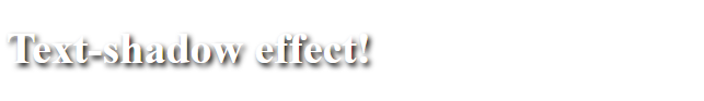
Text-shadow on a white text
h1 {
	color:  white;
	text-shadow:  2px 2px 4px #000000;
}
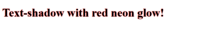
Text-shadow with red neon glow
h1 {
	text-shadow:  0 0 3px #ff0000;
}
Text-shadow with red and blue neon glow
h1 {
	text-shadow:  0 0 3px #ff0000, 0 0 5px #0000ff;
}

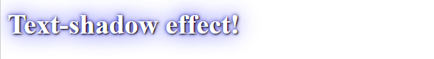
Text-shadow with white text and blue blur
h1 {
	color:  white;
	text-shadow:  1px 1px 2px black, 0 0 25px blue, 0 0 5px darkblue;
}
note
Go to our CSS Fonts chapter to learn about how to change fonts, text size and the style of a text.
Go to our CSS Text Effects chapter to learn about different text effects.